Museum Island

2024

Identity System
Web Design
Print Design
Wayfinding Signage
Merch Design
Sewing

Team

Adeline Park, Conference Director
Livia Lemgruber, Design Lead
Annie Wolfond, Designer
Jamie Tishkoff, Designer
Nicole Miller, Designer
Identity system for the UNESCO world heritage site, Museum Island.
The Brief


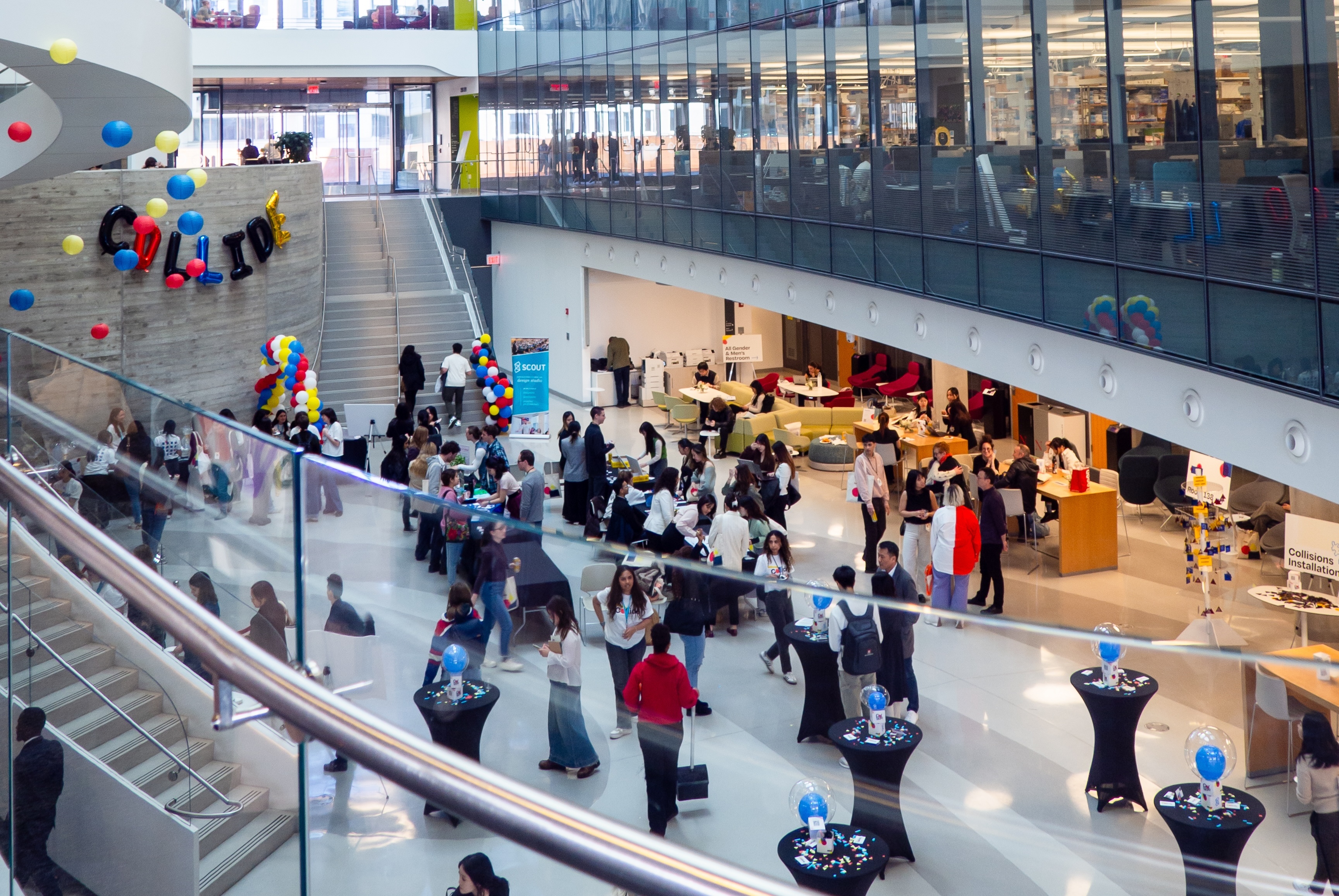
Create a visual identity that represents the theme of Interventions: Collide

The conference is organized around three thought-provoking tracks. Through the theme of collide the goal was to explore
a multidisciplinary, multimedia, and collaborative approach to design.

I worked alongside members of the design team to create this identity and all of the applications for the event.
The Identity
Shape Elements
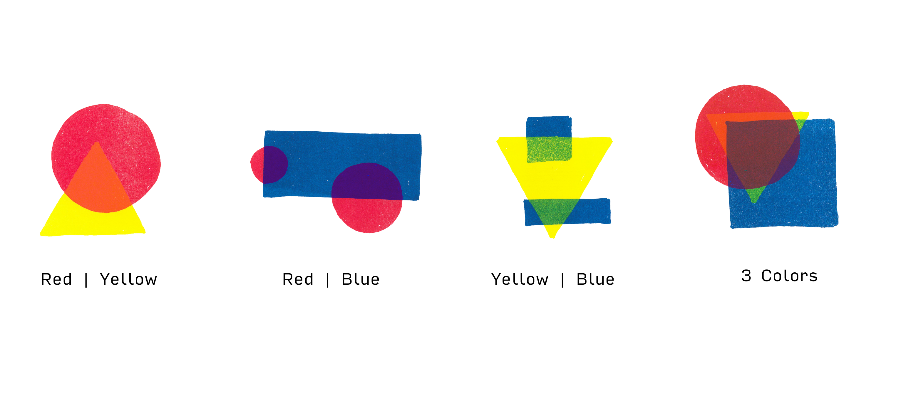
We created three base shape pages and used risograph printing to create variations of combinations and overlaps.
Then, we digitized the shapes and created
a library of shape combinations for use.
Logo Variations
Website
We created a sitemap and began with paper sketches, then lo-fi and hi-fi wireframes. Throughout this process, we worked closely with the developers to make the website come to life.
Marketing Materials
We created series of posters which
were distributed around the city to market the event.

We wanted to emphasize how the multi-media elements collide with the real life environment. So, we created a human-sized poster. We used sewing machines to create stitch lines in the paper, sewed on fabric straps and a clear acrylic pocket. We then took this poster-bag around the city and photographed it in real-life environments.
Tote Bags, Badges, and Swag
We applied the brand to create several items to be given out in a swag kit for attendees of the conference.

For the tote bags we collected second-hand denim which we used to create pockets for each tote bag. These pockets were then all hand stitched by our team.  
Event Program and Wayfinding
We divided the events in the schedule into three categories based on the participants' role in each. These types are represented on the schedule with three distinct icons. Additionally events are marked to indicate their corresponding track.

Museum Island

2024

Packaging Design
Illustration

Team

Livia Lemgruber, Project Lead
Valerie Hui. Design Lead
Annie Wolfond, Designer
Jenna Ory, Designer
Chareese Lam, Designer
Identity system for the UNESCO world heritage site, Museum Island.
The Brief

Rooted Living, Elevated

Rooted Living is Boston’s solution to wasteful snacking. Rachel Domb, the founder, created a snack that is free of refined ingredients and utilizes compostable packaging.

The brand strategy focuses on clarity of communication. With a bolder take on the brand’s existing colors and illustration style, we aimed to elevate Rooted Living to the next level and emphasize the brand's sustainability promise .

The Packaging
Three Flavours
The brand was in the process of launching their third flavour with goals of expanding even more. Our team focused on creating a clear system with flexibility so that it can expand and grow with the product line.

Museum Island

2024

Type Design
Identity system for the UNESCO world heritage site, Museum Island.

Museum Island

Identity system for the UNESCO world heritage site, Museum Island.

2024

Identity System
Brand Strategy
Book Design
Wayfinding
The Brief


Create a visual identity for the UNESCO World Heritage site, Museum Island.

The Berlin Museumsinsel is a complex of buildings composed of individual museums of outstanding historical and artistic importance located in the heart of the city. Each museum represents its own historical perspective, yet they all come together to form one major landmark.

For this project I created an identity system, and several applications for use throughout the site.
First Steps
Research and Discovery
To begin, I conducted research about
the site looking at maps and identifying
key features of the buildings and
surrounding areas.
Images taken from  Google Maps street view depicting architectural and landscape features of the area.
Logo, Type, Colour
I knew that it would be important to emphasize the architecture of each of the five different museums. Each of the simplified shapes in the mark represents one of the buildings on the island.

For the logotype, I created a typeface using a square base and the same geometric shapes to carve out the negative spaces.
Applications
Stationery
The letterheads include variations for each of the museums. For the envelopes and business cards, I used the square dimension from the mark which allows it to become the focal point.
Magazine Ads
The advertisements are designed for
The New Yorker magazine.
City Bikes
Bikes are a major form of transportation around Berlin, and there are several rental bike stations surrounding the museums. Because of this, I chose to create bike wraps with the branding so that they stand out around the city.
Site Sign
The site sign includes information about the museums typeset in German as well as the 6 official languages of the United Nations.
Site Book
This spiral bound book includes information about UNESCO and each world heritage site. It also includes a secondary text with site specific facts and details.

The front and back covers are made from acrylic sheets which I laser cut and engraved to form the logotype and the mark.
Samples of spreads from the site book. The spreads include half page spreads featuring the secondary text on the museums.

Museum Island

Identity system for the UNESCO world heritage site, Museum Island.

2024

Brand Identity
Campaign Strategy
Illustration
Copywriting
UX Design
Pun creation
The Brief

Create an awareness campaign dedicated to a social cause.

Beforeplay is a campaign dedicated to providing accessible and inclusive sexual health education for everyone. For this campaign, I created the identity, rollout strategy, copywriting, and all applications.
First Steps
Research and Discovery
Education surrounding sexual health often uses an abstinence-only approach that focuses solely on cisgender heterosexual couples. This results in unawareness of how topics such as STIs and contraceptives translate to LGBTQ+ relationships and creates a culture where sex is demonized and weaponized.

To combat this, I decided to focus on a a normalization approach. Placing so called "private" topics in public settings to change the narrative and increase comfort.
The Name
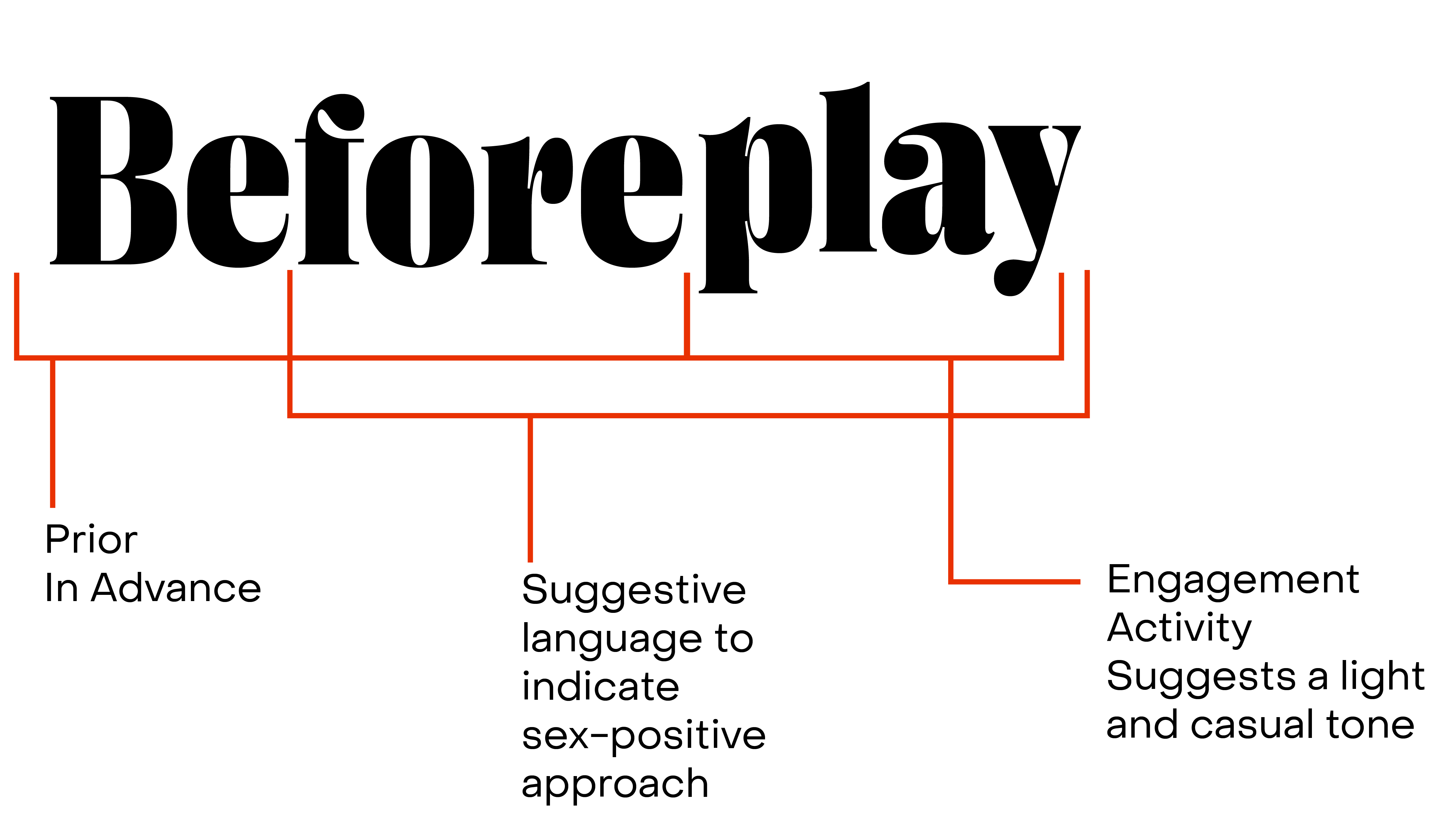
“Beforeplay” is a play on words meant to be provocative and responsible. The name suggests that one should be informed before engaging in sexual activity.
Talk Humour to me!

Sex can be funny, and it can definitely be weird. This campaign does not shy away from that. Instead, I chose to use humour to help ease the tension around the topic.

People feel much more comfortable talking when they can laugh.
Logo, Type, and Colours

The logo has four colour variations for use on a variety of backgrounds.

The type and colour choices are meant to poke at old textbook styles. The brush script is used for callouts emphasising the absurd nature of the text.
Let's Roll Out!
The Truck
This truck is the initial place where people interact with the campaign. It would drive around city streets, attending festivals and college campus events. This places the subject of sex, which is often designated for whispers in private, into a public setting.

A mockup of the truck including the open
window for giveaways, and the screen
allowing for the interactive game element
Interactive Game
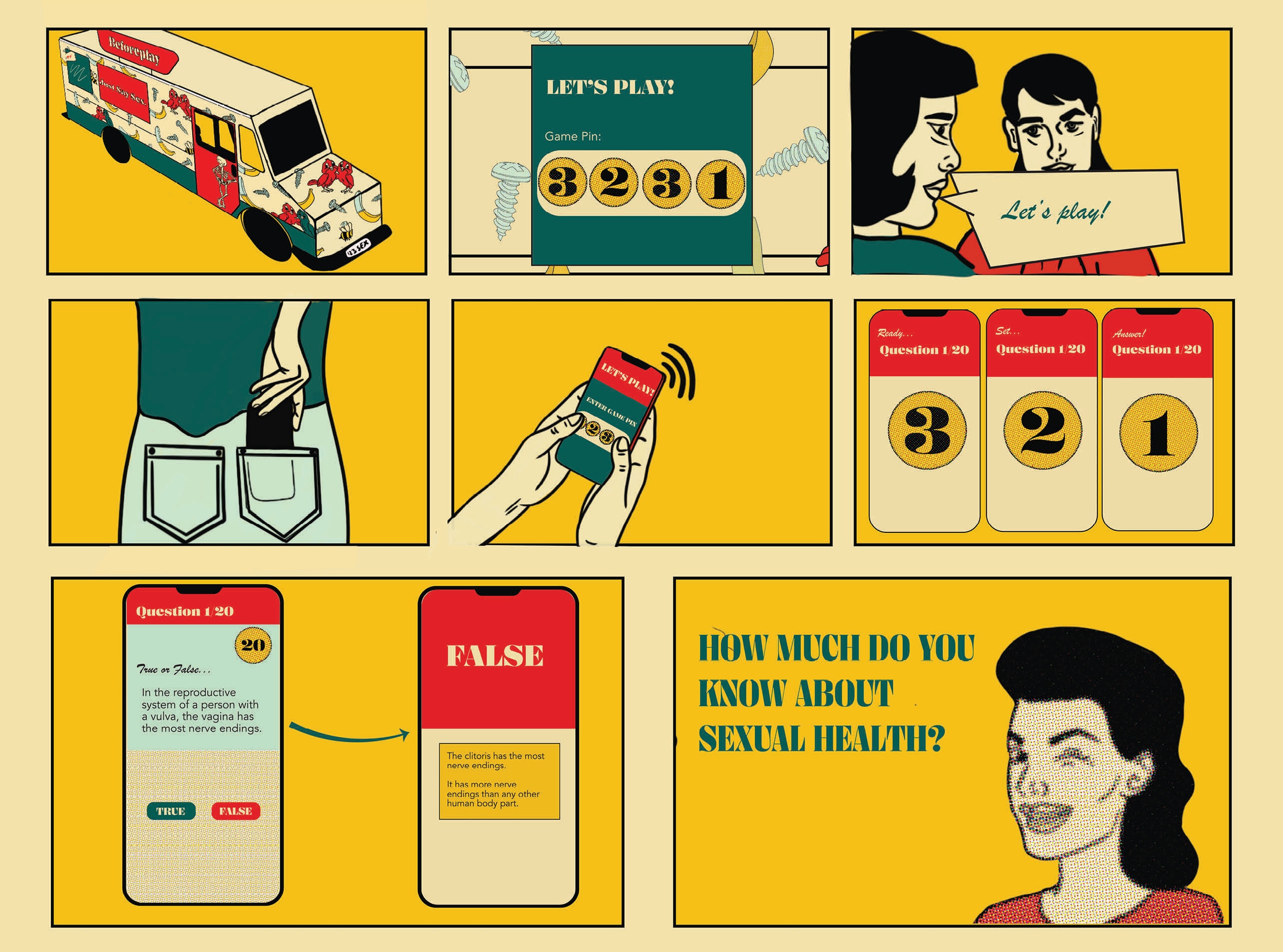
On the outside of the truck,  a screen displays true or false questions with relevant information about sexual health topics.

Participants can join alone or on a team with friends using their web browser. The format of a game is meant to add a challenge and create open dialogue in a low-pressure, fun, and engaging way.
Poster Set
Each poster in the series is focused on a sexual health topic that is often left out of sexual education discussions.

Packaging
These contraceptive and STI prevention materials are free at the truck and around several events and college campuses.
Postcards
Each postcard highlights a popular euphemism for sex, with an illustration designed to illuminate the absurdity of this alternative phrase.

Stickers
Who doesn't love adding a new sticker
to their collection?

The stickers feature illustrations calling attention to missed areas in education.
Card Game
The card game is intended to be played between friends or partners and includes different modes of play to adjust to
the context.
The different game modes are differentiated by colour. While the cards for partners feature more questions focused on the experience together, players are encouraged to explore both sets with whomever they choose.

Museum Island

Identity system for the UNESCO world heritage site, Museum Island.

2024

Typography
Print Design
Design for POS
Packaging Design
My Role
I completed a 6-month, full-time internship at Boston Beer Company. During my time there, I worked on a multitude of print and digital projects, ranging from menus and posters to large scale billboards and packaging design.

Over the course of my co-op, I worked with the Angry Orchard and Samuel Adams teams.
Projects

Print Projects
Packaging

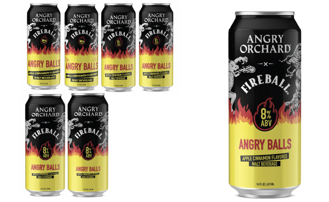
The ask for this project was to create mockups of a 16oz can for a new drink extending the collaboration with Fireball Whisky.

The inspiration for this project came from existing Fireball and Angry Orchard graphics and packages. With this project we were combining two brand icons and imagery which are so different in their illustration style and bringing them together cohesively.

First Rounds
To start, I pulled from existing co-branded assets to create a can that reflected the partnership, while also fitting into the Angry Orchard product lineup.

This version was used for an initial round of concept testing with brands and consumers.
Rounds 2 and 3
For the next rounds we split the options into four concept buckets. I returned back to a previous concept I had done to explore how it could be further applied.

With these rounds I also focused on maximizing the shop-ability and refining the information hierarchy of the product.
Final Round
This round was my final round while on
my co-op. I focused on brightening the colours to make the packaging more eye-catching on shelves. This final version was used in consumer testing along side three different styles.
Current Progress
The Angry Orchard team is still working on this project and I look forward to seeing where they take it next!

Museum Island

Identity system for the UNESCO world heritage site, Museum Island.

2024

Type Design
Research
Physical Prototyping
Material Exploration
Gallery Exhibition

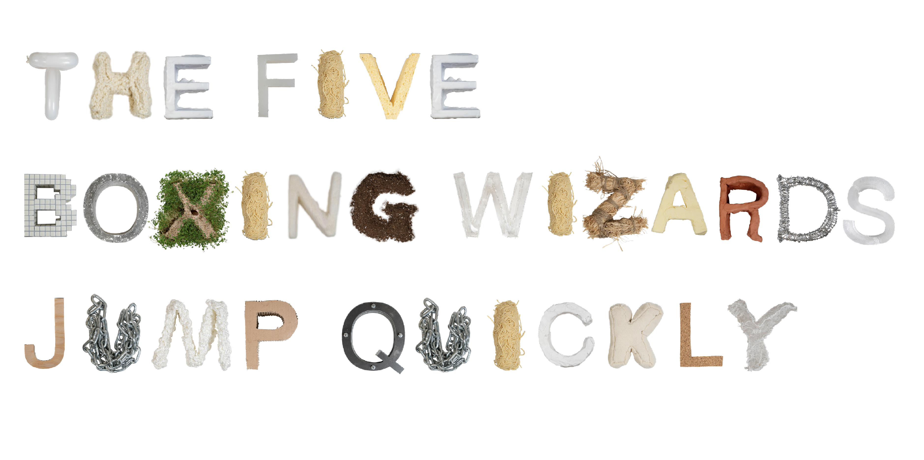
How can I use the power of material messaging to subvert the perception of letterforms?

The history of letterforms is rooted in material processes. Those processes all have significant impact on the shape of letterforms. This project tests how those shapes impact our perception of the letters.
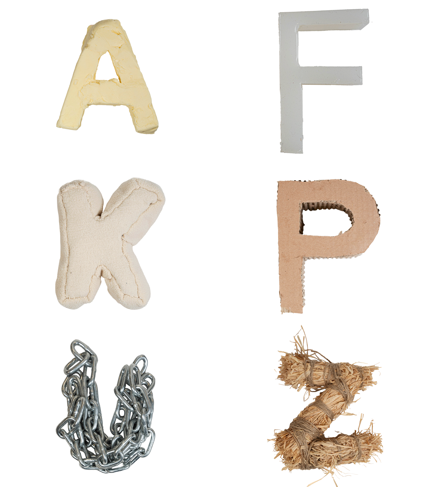
After rounds of research, I created a physical 3D character set using a different material for each letterform to explore the effects that material can have on message.


Some Background
Type has existed well before the invention of the digital font menu. Typography originates in material form, and the shapes of each letterform directly reflect the material and the methods by which it was made.

To begin my research I studied these methods noting how each manufacturing process impacts the letterforms themselves.

Iconicity:

[noun]: corresponence between form and meaning.
When a spoken or written word, or a gestured sign, is iconic in some way of what it's referring to.
This relates to the correlation between the shapes of letters and the sounds that they are perceived to make.
Formal and Material Messaging
The second phase of my research focused on understanding the fundamental elements of form and material as well as the inherent messages that are conveyed through basic attributes.
Lines all have start and end points but how they are manipulated implies direction.

Curves can feel mechanical or hand-drawn and organic.

Shapes can communicate a picture or leave it up to individual interpretation.
Research Study
Participants were provided basic material property scales and asked to rank every letter along each scale. Helvetica was used for this study as it was the least likely to get an extreme reaction.

Matching Process

1. Primary Qualities
I identified and listed the strongest descriptors for every letterform.
2. Flipping
I flipped the strongest attributes, using the opposite values for the material assignments.
3. Material Match
I aligned the letter with a material that matched the flipped attributes.
Establishing a Set
To establish consistency, a series of rules guided the creation process of the letters. These rules were adapted to answer questions throughout the construction process.
Rule 1: Scale
Each letter is set 6 inches for the length. The width is scaled proportionally. They are then each extruded 3 inches from a flat plane.
Rule 2: Colour
Every Material is in its natural colour when possible. When this is not possible, for synthetic materials, the material is as close to white as possible.
Rule 3: Follow The Material
Before working on every letter I asked, "What does this material naturally do?" The process may involve any natural actions of the material, but no forced actions are taken.
At first, I tried to stack the chains to create the U, but chain naturally wants to pile, not stack. So I piled it.

The M was rope and rope doesn't naturally stay wrapped, but it does stay tied.

The B is made from tile and because they were stickers they could bend, but tile doesn't naturally behave this way. So, I let the tile function as pixels, adding to the form where needed to allow it to function the way the material typically would.
Constructing The Forms
Since every letter had a new material, they each required a different process and method. Over the course of five months I worked on these letters through trial and error learning about the materials as I went.

Below are some of the processes I used to create three different letterforms from the set!
The S was created first with a 3D printed mold which I cast in silicone to create a waterproof tray which could be frozen to make ice.
The letter M was made using polypropylene rope. I used a thick crochet hook to interlock loops of the rope together tightly to create a solid form. The letter is made using one continuous piece of rope.
For the letter X, I sculpted the base out of modeling clay, leaving a hole in the top to hold water and adding score lines to allow the seeds to stick.
Then I baked it and soaked it in water for a few hours. I made a gel by soaking chia seeds in water and coated the form. Over the next few months I watered it every other day and watched the seeds sprout.
The seeds on the top of the structure sprouted much less because the channels in the form did not allow for the water to sit close enough to the upper surface.
The Final Letterforms
Due to the nature of some materials, they naturally bent the rules slightly, changing the size of the letter or the width of a stroke.
This first image represents a somewhat forced version of the set.  Meaning that to allow it to function digitally, those inconsistencies were fixed.  Every letter was removed from the environment and scaled to the proportional size to fit the metrics of a digital typeface.
On the other hand, this set is not forced. These are the letters as they naturally are.Each materials reaction to the environment is reflected in this set. For example, the melting S or the transparent W that fades into the background.
Placing the letters together allows you to see how they interact with one another. Does the word "SOFT" still appear soft in this context?
Open Exhibition
Holding an open exhibition allowed me to see how these letterforms were perceived in real time. Attendees were invited to look at and touch the letterforms in a physical space.

Participants who attended were asked to rank the letterforms once again. This time referencing the physical letters in front of them.


This research shows the importance of intentionality around the materiality of letterforms. The material properties of the typeface are as crucial to the decision as the historical context, colour, style, or any other factors one might consider.  

In a 2D digital format, a lot of decisions are automatically made by the software, and there is a long list of typefaces to test and try. This makes consideration of the material properties essential to the message you convey.
The material has the power to shift the perception and change the message.

Museum Island

Identity system for the UNESCO world heritage site, Museum Island.

2024

Type Design
Research
Physical Prototyping
Material Exploration
Gallery Exhibition

The Brief

Design functional packaging for travelers,
adventurers, or people in transition
that supports the consumer’s use of a
product or provides utility through its form.
Some Background
Trans people’s access to healthcare is being constantly targeted and attacked. For those who are able to access hormone replacement therapy (HRT), the products typically comes in standard medical packaging. This can pose a problem as it may not always be safe to have the products visible. After use, the packets must be disposed of but can be easily recognized in the trash. For someone living in an unsafe home or traveling to a destination where trans rights are not recognized, leaving these packets in the trash leaves room for discovery, which can be a risk. This packaging system aims to minimize these risks to improve the discreet and safe usage of HRT.
Process and Methods
I began by interviewing members of the trans community and talking with them about the barriers and struggles they face with using HRT products.


Then I created some initial sketches and prototypes where I focused on methods of concealing a product inside of the package. Here I was looking to find the right balance so that it can be hidden from the opposition but accessible to the audience.

Throughout this process the users journey was very important to the structure of the box. In order to execute the function they need to be given this box by a caregiver at a resource center or doctors office who will demonstrate the mechanics.
The Inner Mechanism
After rounds of prototyping, I came up with a structure that allows an inner box to be released when the outer box is squeezed at two side trigger points.

Through labelling, the outer package is discreet and disguises the product as a basic bandage box at first glance. The upper portion contains disposable envelopes labelled as bandage wrappers to hide the used pouches when thrown in the trash.
Establishing a Set
To establish consistency, a series of rules guided the creation process of the letters. These rules were adapted to answer questions throughout the construction process.
Rule 1: Scale
Each letter is set 6 inches for the length. The width is scaled proportionally. They are then each extruded 3 inches from a flat plane.
Rule 2: Colour
Every Material is in its natural colour when possible. When this is not possible, for synthetic materials, the material is as close to white as possible.
Rule 3: Follow The Material
Before working on every letter I asked, "What does this material naturally do?" The process may involve any natural actions of the material, but no forced actions are taken.
Constructing The Forms
Because every letter had a new material, they each required a different process and method. Over the course of five months I worked on these letters through trial and error learning about the materials as I went.

Below are some of the processes I used
to create three different letterforms from
the set!
The S was created first with a 3D printed mold which I cast in silicone to create a waterproof tray which could be frozen to make ice.
The letter M was made using polypropylene rope. I used a thick crochet hook to interlock loops of the rope together tightly to create a solid form. The letter is made using one continuous piece of rope.
For the letter X, I sculpted the base out of modeling clay leaving a hole in the top to hold water, and adding score lines to allow the seeds to stick.
Then I baked it and soaked it in water for a few hours. I made a gel by soaking chia seeds in water and coated the form. Over the next few months
I watered it every other day and watched the seeds sprout.
The seeds on the top of the structure sprouted much less because the channels in the form did not allow for the water to sit close enough to the upper surface.
The Final Letterforms
Through the nature of some materials, they naturally bent the rules slightly, changing the size of the letter or the width of a stroke.
This first image represents a somewhat forced version of the set.  Meaning that to allow it to function digitally, those errors were fixed, and every letter was removed from the environment and scaled to the proportional size to fit the metrics of a digital typeface.
On the other hand, this set is not forced. These are the letters as they naturally are.Each materials reaction to the environment is reflected in this set. For example, the melting S or the transparent W that fades into the background.
Placing the letters together allows you to see how they interact with one another. Does the word "SOFT" still appear soft in this context?
Open Exhibition
Holding an open exhibition allowed me to see how these letterforms were perceived
in real time. Attendees were invited to look at and touch the letterforms in a physical space.

Participants who attended were asked to rank the letterforms once again. This time referencing the physical letters in front
of them.


Final Results
The red letters represent the results from
the digital study.

The black letters show the results of the
physical letterforms
This research shows the importance of intentionality around the materiality of letterforms in answering this question. The material properties of the typeface are as crucial to the decision as the historical context, colour, style, or any other factors one might consider.  

In a 2D digital format, a lot of decisions are automatically made by the software, and there is a long list of typefaces to test and try. This makes consideration of the material properties essential to the message you convey.
Because, the material has the power
to shift the perception and change
the message.